Every homeowner reaches that moment when their living space feels stale, outdated, or simply uninspiring. The walls that once brought joy now seem bland, and the overall atmosphere lacks the warmth and personality that makes a house feel like home. While many people think a complete renovation is necessary to achieve this transformation, the secret often lies in something much simpler and more affordable: choosing the right color palette.
Color has an extraordinary power to influence mood, create atmosphere, and completely transform the perception of space. A well-chosen color scheme can make a small room feel larger, a cold space feel warmer, or a chaotic area feel more organized and peaceful. The beauty of using color palettes to refresh your living area lies not only in the dramatic visual impact but also in the relatively low cost and effort required compared to major renovations.
Understanding the Psychology of Color in Interior Design
Before diving into specific color palettes, it’s essential to understand how different colors affect human psychology and behavior. Colors have been scientifically proven to influence emotions, energy levels, and even physical responses. This knowledge forms the foundation for creating spaces that not only look beautiful but also feel comfortable and supportive of the activities that take place within them.
Warm colors like reds, oranges, and yellows tend to create feelings of energy, warmth, and intimacy. These colors can make large spaces feel more cozy and inviting, but they can also make small spaces feel cramped if used excessively. Cool colors such as blues, greens, and purples have a calming effect and can make spaces feel larger and more serene. They’re particularly effective in bedrooms and areas designed for relaxation.
Neutral colors serve as the backbone of most successful color schemes. They provide balance, allowing other colors to shine while creating a sense of sophistication and timelessness. However, the key to using neutrals effectively lies in understanding their undertones and how they interact with different lighting conditions throughout the day.
Top Color Palettes for Different Living Spaces
The following color palettes have been carefully selected based on their versatility, timeless appeal, and ability to create different moods and atmospheres. Each palette can be adapted to various room sizes, lighting conditions, and personal preferences.
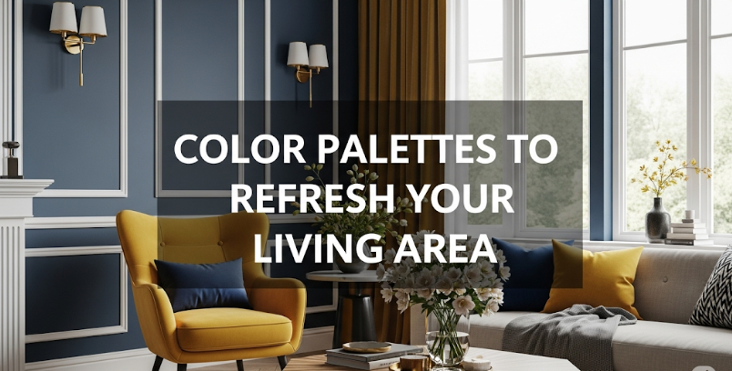
Serene Coastal Palette
Choosing the Right Palette for Your Space
Selecting the perfect color palette involves more than just personal preference. Several factors should influence your decision to ensure the colors work harmoniously with your space and lifestyle. Room size, natural light exposure, existing furniture, and the room’s primary function all play crucial roles in determining which palette will be most successful.
| Room Type | Recommended Palette | Primary Benefit | Best Lighting |
|---|---|---|---|
| Living Room | Warm Earth Tones / Modern Monochrome | Creates welcoming atmosphere | Natural & Artificial |
| Bedroom | Soft Lavender Dream / Serene Coastal | Promotes relaxation & sleep | Soft, Ambient |
| Kitchen | Fresh Botanicals / Sunset Warmth | Stimulates appetite & energy | Bright, Task-Oriented |
| Dining Room | Sunset Warmth / Warm Earth Tones | Encourages conversation | Warm, Dimmable |
| Home Office | Modern Monochrome / Fresh Botanicals | Enhances focus & productivity | Bright, Even |
| Bathroom | Serene Coastal / Fresh Botanicals | Creates spa-like atmosphere | Bright, Clear |
Implementation Strategies for Color Palette Success
Once you’ve chosen your ideal color palette, the implementation process becomes crucial for achieving the desired result. The most successful color transformations follow a strategic approach that considers proportions, textures, and the gradual introduction of color elements.
The 60-30-10 Rule
Professional interior designers often rely on the 60-30-10 rule when implementing color palettes. This principle suggests that 60% of the room should feature a dominant color (usually a neutral), 30% should showcase a secondary color, and 10% should be reserved for accent colors. This proportion creates visual balance and prevents any single color from overwhelming the space.
The dominant color typically appears on walls, large furniture pieces, or flooring. The secondary color might be found in upholstery, window treatments, or area rugs. The accent color appears in smaller decorative elements like throw pillows, artwork, or accessories. This approach ensures that the eye has places to rest while still creating visual interest and cohesion.