New builds boast a certain architectural bravado, often from a place of hubris, when realized from scratch—a clean slate’s seductive promise that the future need not answer to the past. Bureau de Change would argue the opposite. With Trace, their deep retrofit residential project in London’s Euston, the firm proposes something both more difficult and more interesting: that true ingenuity lies not in erasure, but in negotiation.
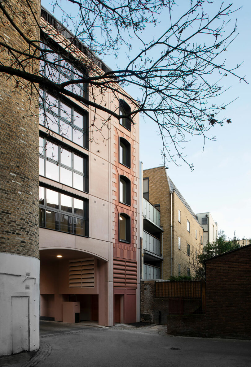
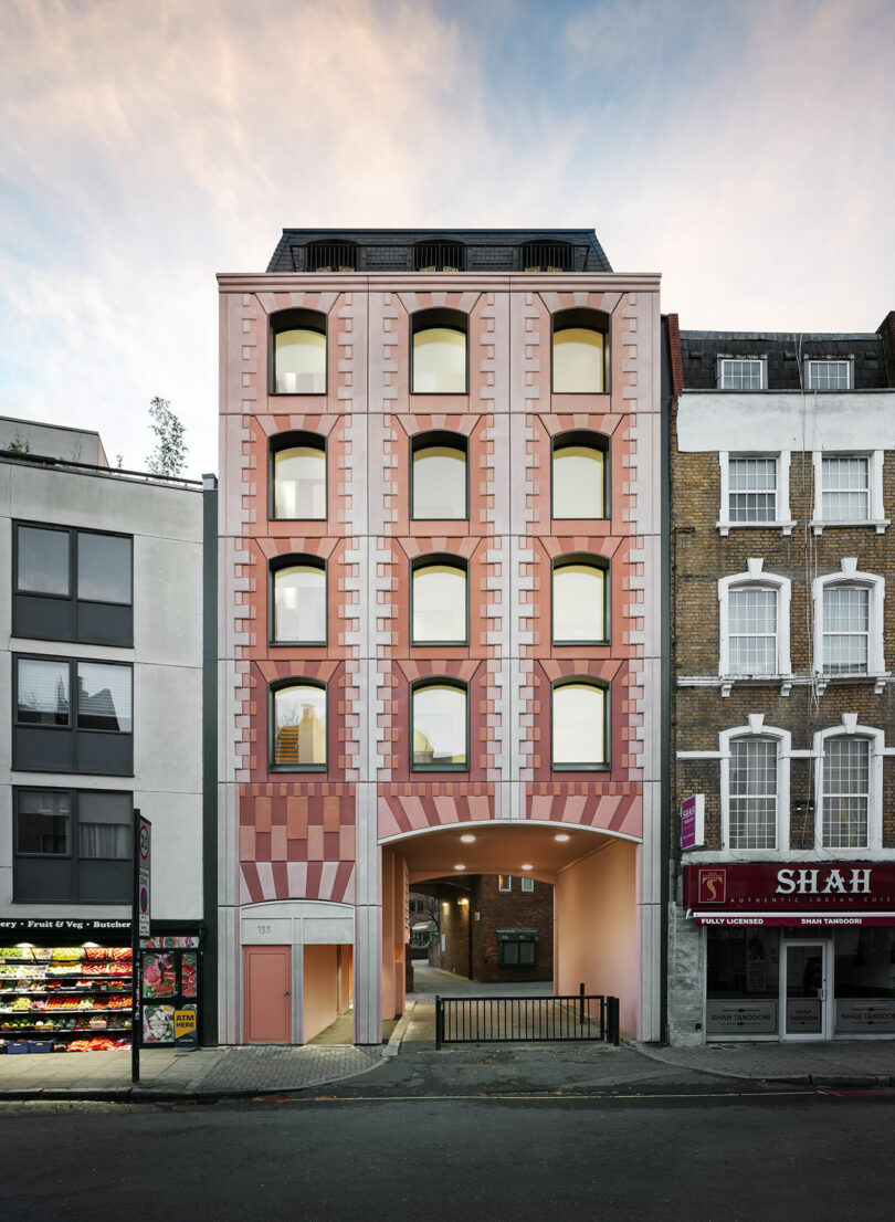
Set along Drummond Street, the project reworks a tired 1980s brick building into five light-filled apartments, adding two new floors while retaining the majority of the existing structure. But this isn’t preservation in the nostalgic sense, nor is it a wholesale reinvention dressed up in heritage cues. Instead, Trace sits, deliberately, on what the architects describe as “a thin line between being religious to references of the past and completely ignoring them.”
It’s a balancing act that feels increasingly urgent. In cities like London, where demolition remains the default mode of progress, adaptive reuse can still read as compromise. Trace reframes it as authorship.

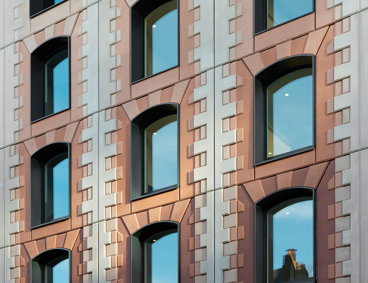
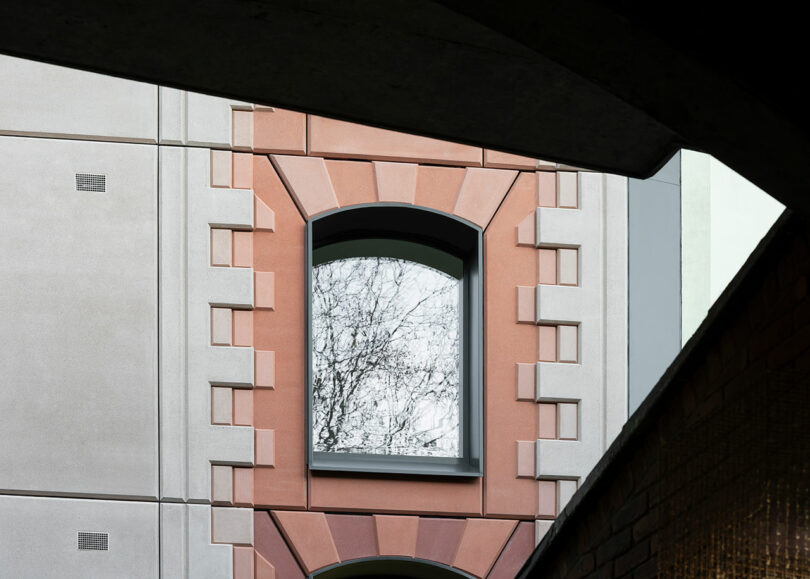
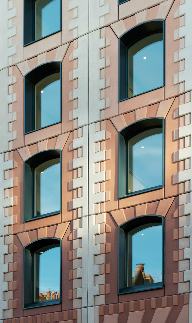
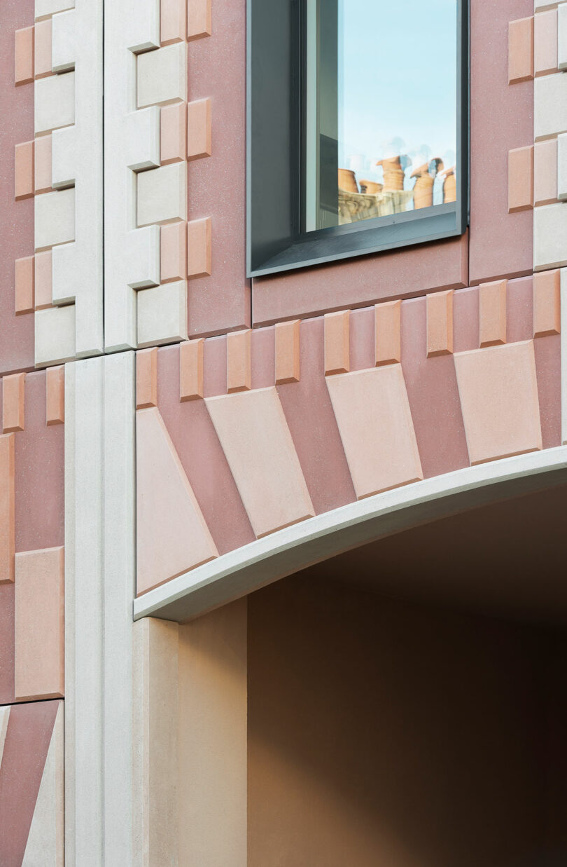
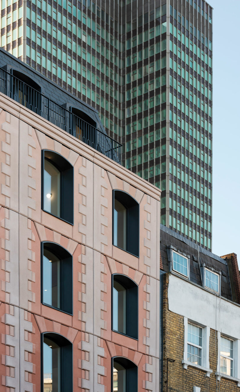
At the heart of the project is a materially literal interpretation of its name. Rather than being discarded, the existing brick facade comprises crushed and reincorporated aggregate within a new glass-reinforced concrete cladding system. The result is a textured, rusticated surface that quite literally embeds the building’s past life into its present form. It is, in every sense, a record of time, laced with lore.
This gesture operates on multiple registers. Environmentally, it significantly reduces construction waste and preserves embodied carbon—an increasingly critical metric in evaluating a building’s true footprint. Conceptually, it transforms demolition from an endpoint into a beginning, folding the act of destruction into a circular narrative of renewal. As the architects note, there’s “something beautiful about encasing the past life of the site into the new building.”
Beauty, here, is not incidental. Bureau de Change’s methodology resists the idea that sustainability must be aesthetic penance. Instead, constraint becomes a catalyst for invention. The crushed brick aggregate produces a richly varied surface, its gradients and irregularities amplifying depth and shadow. And as cities are increasingly defined by flatness—both literal and experiential—this commitment to texture reads subversively.

“Tactility is so important in new buildings,” the studio explains. “We are surrounded by more and more bland flat buildings that make our experience in the city less and less rich.” Their response is architectural seduction: facades that invite a second glance, then a third; surfaces that encourage passersby to slow down, to look up, to reach out and touch. It’s a quiet rebellion against the frictionless scroll of contemporary life.

That same ethos extends to the building’s formal language. Drawing from the surrounding context—Georgian terraces, the ghost of Euston Station, and the layered urban fabric of Tolmer’s Square—the facade reinterprets traditional arches and proportions through a contemporary lens. Openings are organized within a disciplined grid, their segmental forms stretched and scaled to accommodate larger windows, increased daylight, and cross-ventilation.
History becomes less a reference point and more a working material, as it should.
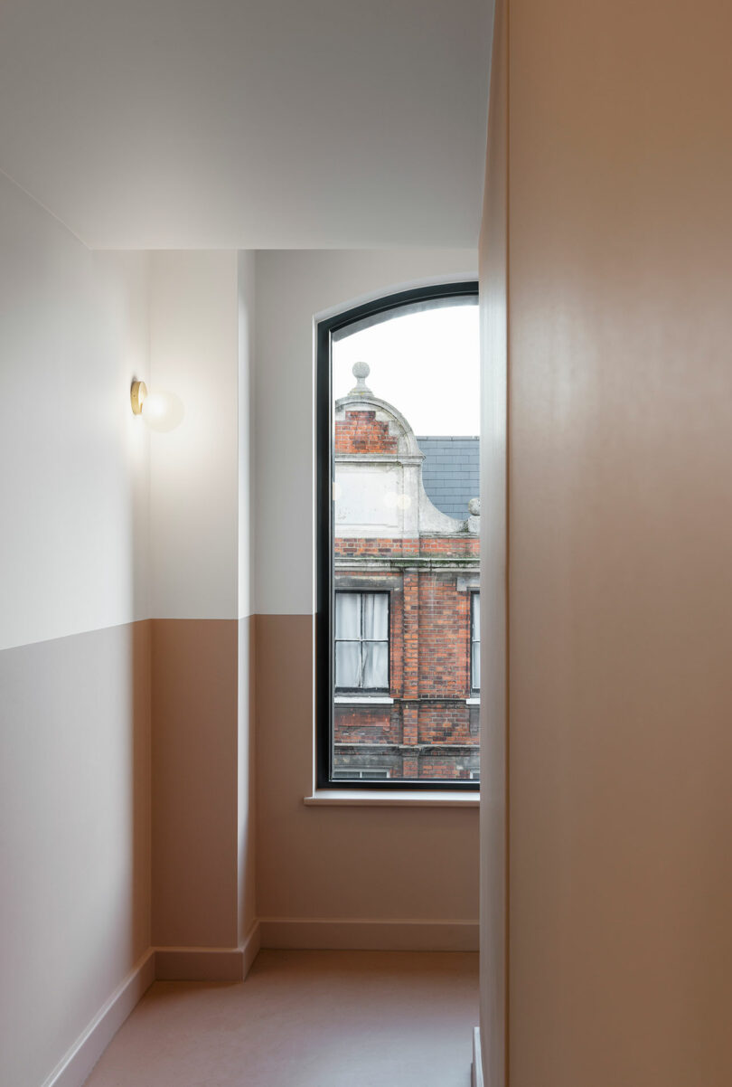
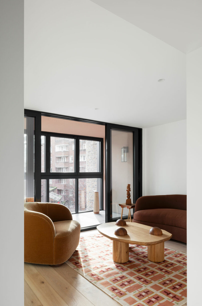
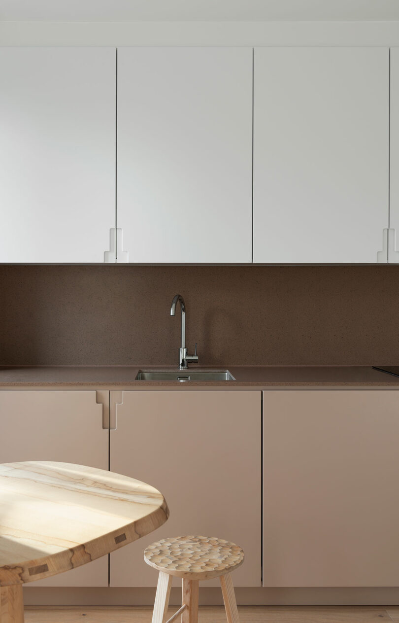
The interiors follow suit. Apartments are arranged in stepped, double-aspect layouts that subtly delineate kitchen, dining, and living zones without resorting to partitions. It’s a spatial strategy that privileges light, air, and adaptability. Winter gardens extend this logic further, occupying that ambiguous territory between inside and out, offering residents a buffer against both density and isolation.
Bureau de Change describes their process as excavation: “We treated this project as archaeologists more than anything else.” Rather than imposing a singular vision, the architects sift through layers of history—Georgian ambition, postwar decline, late-20th-century redevelopment—assembling a narrative that acknowledges what was, while speculating on what could be.
This approach reframes the role of the architect altogether. No longer just a designer of new forms, but a curator of those that exist––and above all, a steward of accumulated meaning. It’s a position that feels both humbling and more radical, particularly in an industry still enamored with spectacle.
There’s nothing timid about Trace, though. Perhaps the most quietly provocative aspect of the project is its scalability. Positioned within the broader ambitions of the Euston Area Plan, the structure demonstrates how small-scale interventions can exert outsized influence. In dense urban environments, these liminal sites—often overlooked in favor of grand masterplans—offer fertile ground for experimentation. In many ways, they offer the ideal testing sites for a more circular, materially conscious architecture.
In an era defined by both environmental urgency and cultural amnesia, adaptive reuse proves to be the most forward-thinking move of all.
To learn more about the firm’s ingenuity and ethos, or to view their portfolio, visit b-de-c.com.
Photography by Gilbert McCarragher..