Whether it’s drenched from floor to ceiling or used as an unexpected accent, color is inarguably one of the most important elements of design. Sometimes, as was the case with this apartment in New York City’s Lenox Hill neighborhood, color can be the driving force behind an entire renovation. When principal architect and designer Aria Jahanshahi of opa Architecture was asked to reimagine this 1,800-square-foot space, his clients gave him one very clear directive: The kitchen had to be red.
“These days, unfortunately, [most] clients and designers play it very safe with colors,” the New York-based architect explains. “We’re used to beige, dark green, or just glossy white kitchens.” But Jahanshahi believes there’s just as much room for creativity in the kitchen as there is in any other room — if not more. “The kitchen really [is] the figurative beating heart of the house, so it should have the most excitement and energy to it,” he says.
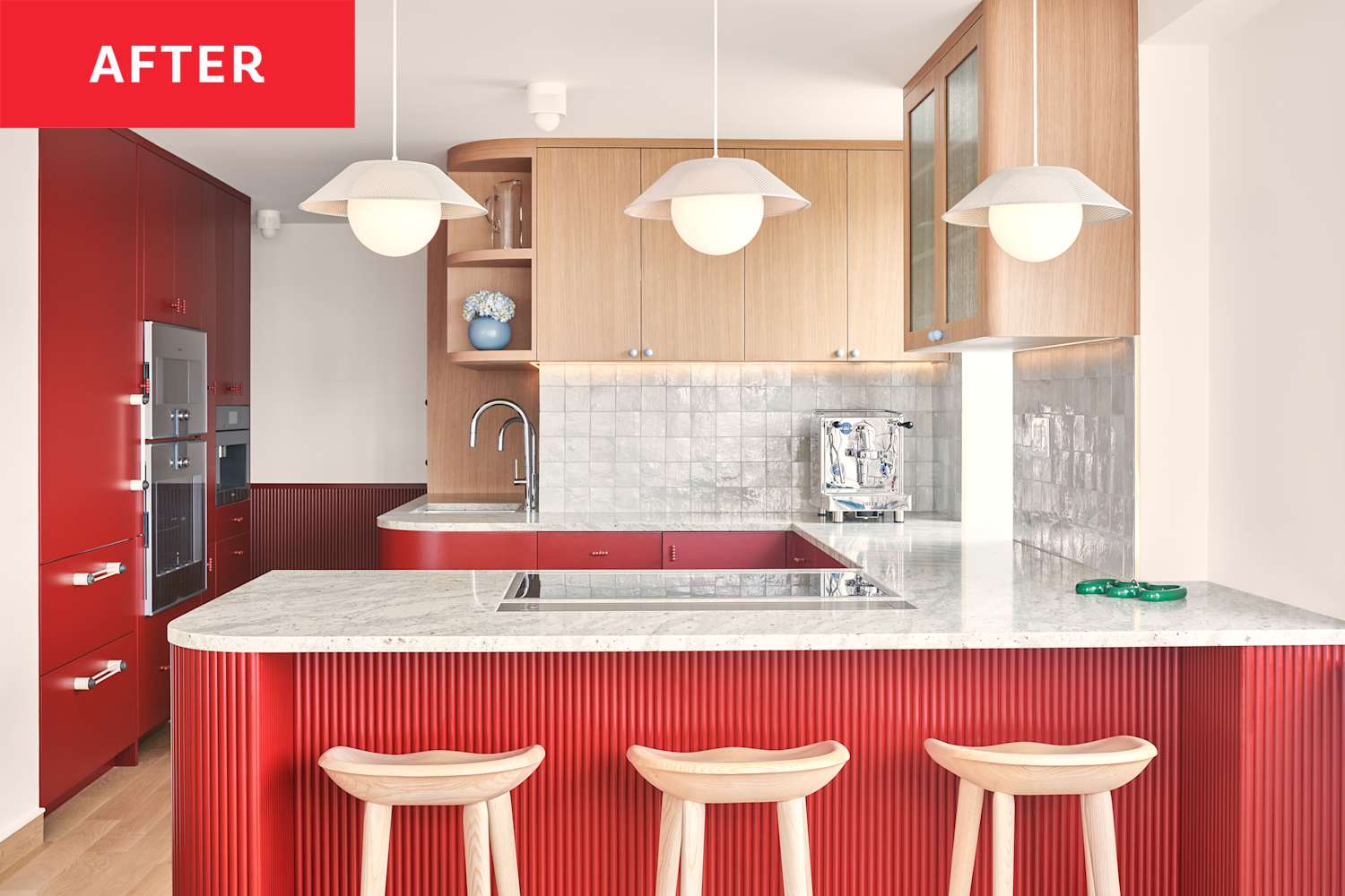
When he first saw this apartment, Jahanshahi described it as “very outdated,” and surmised that the space “hadn’t been touched in decades.” The kitchen had somewhat of a classic “sad beige” vibe — it felt muted, dull, and dark. Part of that was remedied by opening up the floor plan, of course, but the bright red color choice made a huge difference as well.
Right off the bat, Jahanshahi and his clients got to work selecting a specific shade of red: Ultimately they settled on Benjamin Moore’s Classic Burgundy HC-182. They kept it concentrated on the lower cabinets only for a balanced pop of color that feels simultaneously bold and carefully considered. The kitchen’s burgundy hue certainly makes a statement, but Jahanshahi didn’t want the shade to overwhelm the space; he knew that would be a fine line to walk.
The architect ultimately took a “collage” approach to the kitchen, and incorporated materials that could balance out the bold millwork. “We knew that the burgundy millwork would be a high-gloss sheen, but [wanted to add elements] that could be a visual relief to that,” he says. Fluted detailing along the peninsula did just that. Jahanshahi explains, “We did the fluting to kind of visually break up the high-gloss, pure monolithic nature of everything.”
For the upper cabinets they chose a light blonde wood, and paired it with light stone countertops and a beautiful white backsplash to keep the space feeling light and airy. The hand-hewn Moroccan tiles from Zia allow light to “ripple” off the backsplash, yet the texture still feels intrinsically different from the glossy red cabinets. The Andromeda White granite countertops even feature cranberry flecks for a perfectly subtle tie-in to the burgundy cabinets.
Jahanshahi truly thought of every detail — even the practical ones. He cleverly integrated plenty of smart features so that this bold kitchen wouldn’t just be beautiful, but also well-functioning and livable. “There are pull-out steps so that the children can reach the upper cabinets,” he told me. “There are also pull-out spice racks and pull-out pantries, so we really utilize every square inch of the millwork.”
Color psychology will tell you shades of red are often linked to passion, power, and sometimes anger — but Jahanshahi made it feel homey in this kitchen. And that goes way beyond cohesive colors and textures; the architect paid careful attention to the lines and the flow of the space. Adding “softer” architectural details — like arches and curved shelving — helped offset the bold color and achieve a smoother “flow” between spaces.
“We wanted to avoid hard, 90-degree angles on millwork,” the architect told me. “There are a lot of kiddos running through the house, but [the curves] also help anyone to [more] easily move through the space in a fluid manner.”
The rest of the apartment is just as brilliant as its heart: the kitchen. Between a cobalt bedroom, lilac-tinged bathroom, and the occasional red hardware, the design was meant to spark joy every day for its inhabitants. “The colors in the apartment are much more like cinematic statements or bold color washes that allow you to feel like you’re in your own space,” Jahanshahi says. “That was critical to us.”
“Bold color is the icing on the cake, but really the cake is so much more than that,” the architect explains. The key is in crafting not just a complementary color palette, but also “little moments where that color is brought into other materials in a subtler way to thread the needle … it’s a way of bringing the color through to a fuller narrative about the space.”